Build muscle
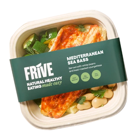
High-protein meals to support training and recovery.
Foundations
Motion tokens describe how surfaces move, not just how fast. They come in families — a duration, an ease, and any distances the movement needs — so a whole interaction can be retuned by editing the family rather than hunting transitions across components.
Every family respects prefers-reduced-motion. Under it the durations collapse to 0s and any offsets or scales reset to neutral, so the end state is reached with no animation. If you have reduced motion enabled, the values below will read that way.
One family is not like that, on purpose. fan is split into two groups — an arrangement group and a transition group — and reduced motion zeroes only the transition group. Zeroing the arrangement values would stack all twelve cards of a fanned deck dead-centre, because in a fan the geometry is the resting layout rather than a departure from it. Each group below states its own verdict, and ADR 0023 has the reasoning.
Chrome reveal, nav drawers and slide-over panels. Reduced motion collapses the duration to 0s so the panel appears instantly rather than sliding.
| Token | Value | Use for |
|---|---|---|
--motion-duration-panel | 0.32s | Slide duration for chrome reveal and drawer/panel transitions. |
--motion-ease-panel | cubic-bezier(0.4, 0, 0.2, 1) | Standard ease-in-out for panel movement — no overshoot. |
The pointer response of a raisable surface. The card rises and its shadow deepens; the focal image inside rises further and zooms slightly, so the product leads the surface it sits on. Hover-capable pointers (mouse) reach that end state on `:hover`; touch pointers reach the same end state via touch-down, but slower — a long, hard-decelerating creep that reads as elastic strain rather than a snap, settling back at the normal speed on release. Keyboard focus uses the same end state as hover, at every breakpoint. Reduced motion zeroes every offset, the scale, and both durations, leaving the card completely still.
| Token | Value | Use for |
|---|---|---|
--motion-duration-lift | 0.28s | Duration of the surface rise and focal parallax on hover/focus, and of release from a touch-down hold. |
--motion-ease-lift | cubic-bezier(0.34, 1.4, 0.64, 1) | Short overshoot so the card settles rather than stopping dead — a spring approximation. |
--motion-lift-offset | -10px | How far the surface itself rises — shared by the hover/focus lift and the touch-down hold. |
--motion-lift-focal-offset | -20px | How far the focal image rises — larger than the surface, which is the parallax. |
--motion-lift-focal-scale | 1.08 | Focal zoom on hover/touch-down. Tuned down from 1.3 so the image clears surrounding copy. |
--motion-duration-lift-hold | 1.4s | Duration of the touch-down creep toward the same lift offset — long, so the strain reads. |
--motion-ease-lift-hold | cubic-bezier(0.16, 1, 0.3, 1) | Hard-decelerating (expo-out) ease for the hold: fast off the mark, then a long flat tail. |
How a group of items arrives. Each fades in and rises into place, one after another rather than all at once, so the eye is led along the row. The stagger is the point — it is what makes a list read as a sequence instead of a block appearing. Triggered when the group scrolls into view, once — or, for content at the top of the page that may only peek above the fold, as soon as any of it is on screen at load (`on-screen-at-load`). Under reduced motion the offset and stagger drop to zero and the items are simply present.
| Token | Value | Use for |
|---|---|---|
--motion-duration-reveal | 0.5s | How long one item takes to fade and rise. |
--motion-ease-reveal | cubic-bezier(0.22, 1, 0.36, 1) | Firm ease-out — quick to start, settling gently, as befits something arriving. |
--motion-reveal-offset | 20px | How far each item rises as it fades in. |
--motion-reveal-stagger | 100ms | Delay added per item, multiplied by its index. Total run is stagger × count, so keep it short. |
What happens when a link sends the eye to something already on the page — a CTA anchoring back to the secondary hero's form. The page snaps to the target with a short, smooth scroll on the reveal ease, so it lands rather than drifts; the target then pulses three times per tap, on the panel ease: each pulse swells it a little and fades a 4px stroke in the selected colour (`--color-interactive-selected`, `--border-thick`) in and out around it, so it reads as a breath rather than a bounce. Driven by `useAnchorArrival` (src/system/), which reads these from the CSSOM. Under reduced motion the scroll becomes a jump, the pulse duration drops to zero and its scale to 1, so nothing moves.
| Token | Value | Use for |
|---|---|---|
--motion-duration-anchor-scroll | 0.2s | The snap scroll to the link's target. Eased by --motion-ease-reveal. |
--motion-duration-anchor-pulse | 0.6s | One pulse, out and back, once the scroll has landed; the whole run is this × the count. Eased by --motion-ease-panel. |
--motion-anchor-pulse-count | 3 | How many pulses play per tap. |
--motion-anchor-pulse-scale | 1.02 | Peak scale at the middle of each pulse, where the stroke is strongest. About 10px of growth on the 498px form card. |
How long an auto-advancing tab group holds one tab before moving to the next (SectionTabbedMedia, plan 28 slice 4). One token, read by two things that must never disagree: the progress ring's CSS animation and the component's JS advance timer, which reads it from the CSSOM rather than duplicating the number. A token and not an author control on purpose — `ControlsSchema` has no number kind, so retuning the dwell is a one-line change here. Under reduced motion the component switches auto-advance OFF entirely instead of shortening it; this value is deliberately NOT zeroed, because a 0s dwell would spin the tabs rather than stop them.
| Token | Value | Use for |
|---|---|---|
--motion-duration-tab-dwell | 10s | Dwell per tab before the group advances, and the exact run of the depleting progress ring. |
The mobile logo row in SectionLogoWall scrolls on its own, as one endless line. Its run is this step multiplied by the number of logos, so a longer list moves at the same speed rather than faster. A logo longer than 3.75:1 is capped in width, so the speed in pixels per second for a given step depends on the logo mix. Pausable by a button, and by hover over or focus on the logos. Under reduced motion the row does not move at all and becomes a swipe row; this value is deliberately NOT zeroed, because a 0s run would flicker rather than stop.
| Token | Value | Use for |
|---|---|---|
--motion-duration-logo-scroll-step | 2.5s | Time for one logo to pass; the full loop is this × the logo count. |
--motion-duration-logo-line-step | 3.7s | The Scrolling line layout, mobile: time for one logo to pass (slower than the Rows line). |
--motion-duration-logo-line-step-desktop | 4.2s | The Scrolling line layout, desktop: time for one logo to pass; the loop is this × the logo count. |
A deck of overlapping cards that follows the pointer — the first motion in the system driven by continuous input rather than triggered by state (CardFan; ADR 0023). Every card derives its position, rotation, depth-scale, dim and opacity in CSS from one number, `--fan-progress`, which the component drives from pointer events and settles by transitioning. That is why there is no animation dependency and why the duration and easing below are real tokens rather than decoration. This family is the only one in the system split into two groups, because it is the only one carrying layout values alongside motion values — and they must NOT be treated alike under reduced motion.
Under prefers-reduced-motion: PRESERVED. Reduced motion does not touch a single value in this group, and must not.
Where the cards sit. In `lift` and `reveal` the offset token is a transient departure FROM the resting layout, so zeroing it correctly means “stay put”. In the fan the geometry IS the resting layout: zeroing the x-offset and depth-scale would stack all twelve cards dead-centre and destroy the component. These are layout tokens that live in a motion family for discoverability. If you have come here to make the reduced-motion block consistent with the other families, this is the paragraph that says don't.
| Token | Value | Use for |
|---|---|---|
--fan-card-width | 308px | The width the deck lays cards out at — 3 of 12 columns of a 1232px content width, the front card's width in Figma `792:3714`. It lives with the deck rather than with the card so the card stays width-agnostic and reusable outside a fan, and the container stays card-agnostic. Below desktop it becomes the container width less the layout margin, matching the Figma mobile frame. |
--fan-offset-x-max | 277px | The cap on the horizontal shift per step of offset from the front card (~0.675 card widths). The shift itself, `--fan-offset-x`, is not a fixed number: CardFan.module.css derives it per deck from the deck width, the card width and the visible card count, then clamps it to this cap. At the 1232px desktop deck it resolves to 231px, so the cap is never reached there. The two narrower tiers are container queries: a 58px cap on tablet, and on phone a floor of the layout bleed (80px). |
--fan-lift-y | 0px | How far each card sinks per step of offset. Zero at every tier since Figma `792:3714`: the cards sit level, centred on one line. |
--fan-rotation-step | 0deg | Rotation per step of offset. Zero at every tier since Figma `792:3714`: the cards are not angled. |
--fan-depth-scale-step | 0.11 | How much smaller each card gets per step of offset — the depth cue. Draws the cards behind at 0.89x and 0.78x of the front card. |
--fan-front-scale | 1 | Scale of the front card. 1 since Figma `792:3714`, which draws the front card at true size; a scale-up would draw its type larger than its tokens. |
--fan-visible-count | 5 | How many cards read at full opacity. The next one out fades as it arrives or leaves — that fade is the endless wrap's only visible seam. |
--fan-depth-dim-step | 0.10 | How much darker each card gets per step of offset, applied as `brightness()`. Desktop only — the two narrower tiers set it to 0. A depth cue like scale, which is why it is here and not in the transition group: a still deck still needs its front card to read as the front. The front card's offset is 0, so its dim is 0 and its text contrast is untouched. |
Under prefers-reduced-motion: ZEROED. Steps become instant; the deck jumps between positions.
How the deck gets from one card to the next. Both eases are damped springs authored as `linear()` curves, which is how there is genuine overshoot with no animation library. Under reduced motion the durations collapse to 0ms and CardFan additionally forces its instant mode, so the momentum projection cannot glide either — leaving a still, fully-separated deck that jumps. Nothing collapses and nothing overlaps illegibly.
| Token | Value | Use for |
|---|---|---|
--motion-duration-fan-step | 480ms | A deliberate step: arrow key, flanking control, or clicking a card to promote it. |
--motion-duration-fan-settle | 800ms | Settling onto a whole card after a drag or flick is released. |
--motion-ease-fan-step | linear(…) | Damped spring, ζ 0.75, peaking at 1.0284 — a 3% nudge past the target. Deliberate moves should feel answered, not thrown. |
--motion-ease-fan-settle | linear(…) | Damped spring, ζ 0.52, peaking at 1.1474 — real overshoot, ~15% past the target before it comes back. This is the curve a flick lands on. |
Hover the card. The surface rises by --motion-lift-offset, the tray rises by --motion-lift-focal-offset and zooms by --motion-lift-focal-scale. Keyboard users get the same response via :focus-within when they tab to the card’s CTA, at every breakpoint.
On a touch device, touch and hold the card instead of hovering it: it reaches the same offset, but slowly, over --motion-duration-lift-hold on a hard-decelerating --motion-ease-lift-hold curve — fast at first, then creeping, which reads as elastic strain rather than a second, deeper state. Release settles back at the ordinary --motion-duration-lift regardless of how long the hold ran. Hover and touch-down are gated to hover: hover and hover: none respectively — every pointer covered once, never twice.
Build muscle
High-protein meals to support training and recovery.
Scroll this row into view. Each card fades in and rises by --motion-reveal-offset, offset from the one before it by --motion-reveal-stagger. It runs once. Reload the page and scroll back down to see it again.
This is a shared primitive (app/globals.css), not a card or carousel behaviour — any container of items can adopt it:
The primitive itself has no opinion on breakpoint — it is a consumer decision. CardLayout runs it at EVERY breakpoint (plan 22 reversed an earlier desktop-only rule): the staggered arrival plays on touch too, coexisting with the touch-down lift because the reveal animates the track item while the lift transforms the card surface inside it — the two never fight over the same transform.
Nine consumers share it today: this demo’s CardLayout, CardFan, SectionCardQuotes, SectionCardGrid, SectionCardStats, SectionCardPhotos and SectionMediaPills arm it on scroll into view; the secondary SectionHero’s form arms it on screen at load (below); SectionTabbedMedia arms it on scroll into view for a panel’s first arrival, then replays it on every subsequent tab swap via a keyed remount.
useRevealGroup (src/system/useRevealGroup.ts) — a seam over useRevealOnScroll that returns containerProps, itemProps(stagger, className?) and RevealNoscript, so a new consumer wires all five pieces below without re-deriving them.data-reveal="pending"|"in" on the container, driven by the useRevealOnScroll hook underneath the seam (src/system/useRevealOnScroll.ts) — it watches the container and flips to "in" the first time it scrolls into view."on-screen-at-load" as the third argument for content at the top of the page that may only peek above the fold — a short phone, or the browser’s bars showing: if any of it is on screen when it is first observed, it reveals straight away instead of waiting for the first scroll..reveal-item class on each child that should fade and rise.--reveal-index per child (its position in the group) so the CSS stagger delay is index × --motion-reveal-stagger.<noscript> block that forces .reveal-item back to visible — without JS the observer never fires, so the container never leaves "pending".Build muscle
High-protein meals to support training and recovery.
Lose weight
Portion-controlled, macro-balanced, under 500 kcal.
Increase energy levels
Balanced meals that help prevent afternoon crashes.
Drag the deck sideways and let go — the release projects your velocity forward and settles onto a whole card on --motion-ease-fan-settle, which overshoots by about 15% before coming back. Step it with the arrows beside it or with ←/→ once the deck has focus and you get the calmer --motion-ease-fan-step instead, a 3% nudge. Click any card behind the front one to promote it. The front card does nothing.
There are twelve cards here and no ends: the geometry is progress mod 12, so the deck wraps forever, and the only visible seam is the trailing card fading out as a new one arrives. Nothing in this is a scroller and nothing is an animation library — it is one registered custom property, --fan-progress, being transitioned.
Turn reduced motion on and try it again. The deck stays exactly as fanned, as dimmed and as separated as it is now — it simply jumps between positions instead of gliding. That is the two-group split doing its job: if the arrangement group were zeroed alongside the durations, all twelve cards would be stacked dead-centre right now.
Card 1
Drag the deck, or click a card behind the front one.
Card 2
Drag the deck, or click a card behind the front one.
Card 3
Drag the deck, or click a card behind the front one.
Card 4
Drag the deck, or click a card behind the front one.
Card 5
Drag the deck, or click a card behind the front one.
Card 6
Drag the deck, or click a card behind the front one.
Card 7
Drag the deck, or click a card behind the front one.
Card 8
Drag the deck, or click a card behind the front one.
Card 9
Drag the deck, or click a card behind the front one.
Card 10
Drag the deck, or click a card behind the front one.
Card 11
Drag the deck, or click a card behind the front one.
Card 12
Drag the deck, or click a card behind the front one.