Brand
Logo
Our logo is bold, accessible, and memorable. It carries the Frive food tray — a distinctive symbol of thoughtfully prepared meals — and anchors recognition across product, marketing, and partnerships.
Our logo proudly sits at the top of our brand. Or in the middle, or bottom left — placement follows context, but the mark itself stays consistent.
Reference: Wordmark in Figma · Strapline lockup in Figma

Logo variants
Four approved SVGs cover colour and strapline combinations. Pick contrast first, then decide whether the campaign or surface needs the full “FOOD TO THRIVE” lockup.
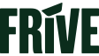
Kale wordmark
Default mark on light backgrounds: headers, app shell, print where colour is available.

Kale + strapline
Use when you need the brand promise visible in one lockup — launch campaigns, hero moments, onboarding.
White wordmark
Master variant on dark or photographic backgrounds. The design system uses pure white (not cream) for this mark.

White + strapline
Full lockup on dark surfaces — outdoor-style panels, video end cards, social cover images with deep fields.
Colour variants
Three colour treatments cover digital and print. Kale and white are the everyday pair; black is for single-colour constraints.
Updated from legacy guidelines: cream-on-dark has been replaced with white in the current system for clearer contrast and simpler implementation.
Primary (kale)
Master logo on light surfaces — default for product UI.
White
Master variant on dark or busy imagery with enough shadow.
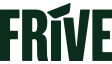
Black
Reserved for monochrome printing or strict single-ink applications. For web previews only; supply a dedicated black SVG for production artwork where required.
Clear space
Minimum clear space around the logo equals the width of the lowercase letter “f” in the Frive wordmark. No other graphics, type, or interface chrome may intrude inside that buffer.
Give it room to do its thing — the tray and letterforms need quiet space to read.
Dashed frame suggests the protected zone; side markers approximate the “f” width rule.
Sizing and responsive behaviour
The Logo component exposes three presets. Height is fixed at 32px, 64px, or 128px; width scales with the SVG aspect ratio so the mark is never squashed. Use the same preset across breakpoints unless a specific layout explicitly calls for a different tier.
Small — 32px high
Favicons, compact navigation, inline references, app icons.
Medium — 64px high
Default for marketing pages, headers, and system sidebars.
Large — 128px high
Hero sections, splash screens, flagship campaign art.
Usage examples
On solid backgrounds
Choose kale-on-light or white-on-dark for maximum legibility. Avoid mid-tone greens or grey bands that reduce contrast.
On imagery
When the background is busy, favour the full wordmark (or strapline lockup) and a scrim, panel, or blur behind the mark so the tray stays readable.
Social media
Full wordmark or strapline lockup for avatars and cover images; use the small preset inside circular crops. Pair with the bowl emblem for favicon-sized touchpoints when the full wordmark is illegible.
Marketing launch
Strapline lockup reinforces “Food to Thrive” during the first 6–12 months of a major campaign before simplifying to the wordmark where space is tight.
Misuse
The examples below illustrate disallowed treatments. They use raw <img> demos so we never ship distorted assets through the Logo component.
Do not stretch
Do not overlap shapes
Do not alter strapline wording or scale
The lockup is fixed — never typeset a custom tagline inside the approved artwork.
Do not outline the logo
Do not recolour arbitrarily
Do not place imagery inside the mark
Do not mask photos or patterns into the letterforms or tray silhouette.
Partnerships
Partner lockups lead with the relationship line, then the partner mark, with Frive following at a respectful distance. Use uppercase “IN PARTNERSHIP WITH” set in body or sub-headline styles; keep both marks at visually equal prominence unless contractually specified otherwise.
IN PARTNERSHIP WITH
Using the Logo component
Import from @/components/core/Logo. The component renders the SVG as a plain <img> with explicit dimensions to prevent layout shift. It is lazy by default; pass priority above the fold (the header, a hero lockup) to load it eagerly at high priority.
import { Logo } from '@/components/core/Logo';

export function Example() {
  return <Logo variant="default" size="md" />;
}
<Logo variant="default" size="md" includeStrapline alt="Frive, food to thrive" /><Logo variant="white" size="lg" /><Logo variant="default" size="sm" />
<Logo variant="default" size="md" />
<Logo variant="default" size="lg" /><Logo variant="white" size="md" priority alt="Frive home" />Download logo files
Production-ready SVGs for design tools and engineering. Right-click or use your browser’s download action if the button opens a preview instead.